Disney Visa Debit Website Redesign
Problem
The existing site lacked visual cohesion and didn’t reflect the fun, family-focused spirit of the Disney Visa brand. Users were also unclear on card perks and how to apply, which led to a confusing, less engaging experience.
Approach
I led the visual design for a full site refresh & rebrand bringing in bold branding, playful layouts, and clear calls to action. By reworking the information hierarchy and using magical, on-brand visuals, we created a more delightful and intuitive user journey.
View Website
Client:
Disney Visa Debit
Goal:
Create a redesign of website for better user experience and adjust website to newly created brand assets.
Role:
UI UX Designer
Scope:
Wireframe
UI/UX
Digital Design
Design System
Tools Used:
Adobe XD
Adobe Illustrator
Adobe Photoshop
Timeline
Redesign: From explorations to final designs in 8 weeks while working with multiple projects at the same time.
Rebrand: From explorations to final designs in 8 weeks while working with multiple projects at the same time.
Before diving into design, I took time to understand what Disney Visa Debit Cardholders needed—focusing on features, usability, and staying true to Disney’s brand.
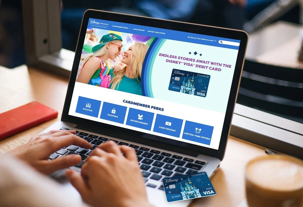
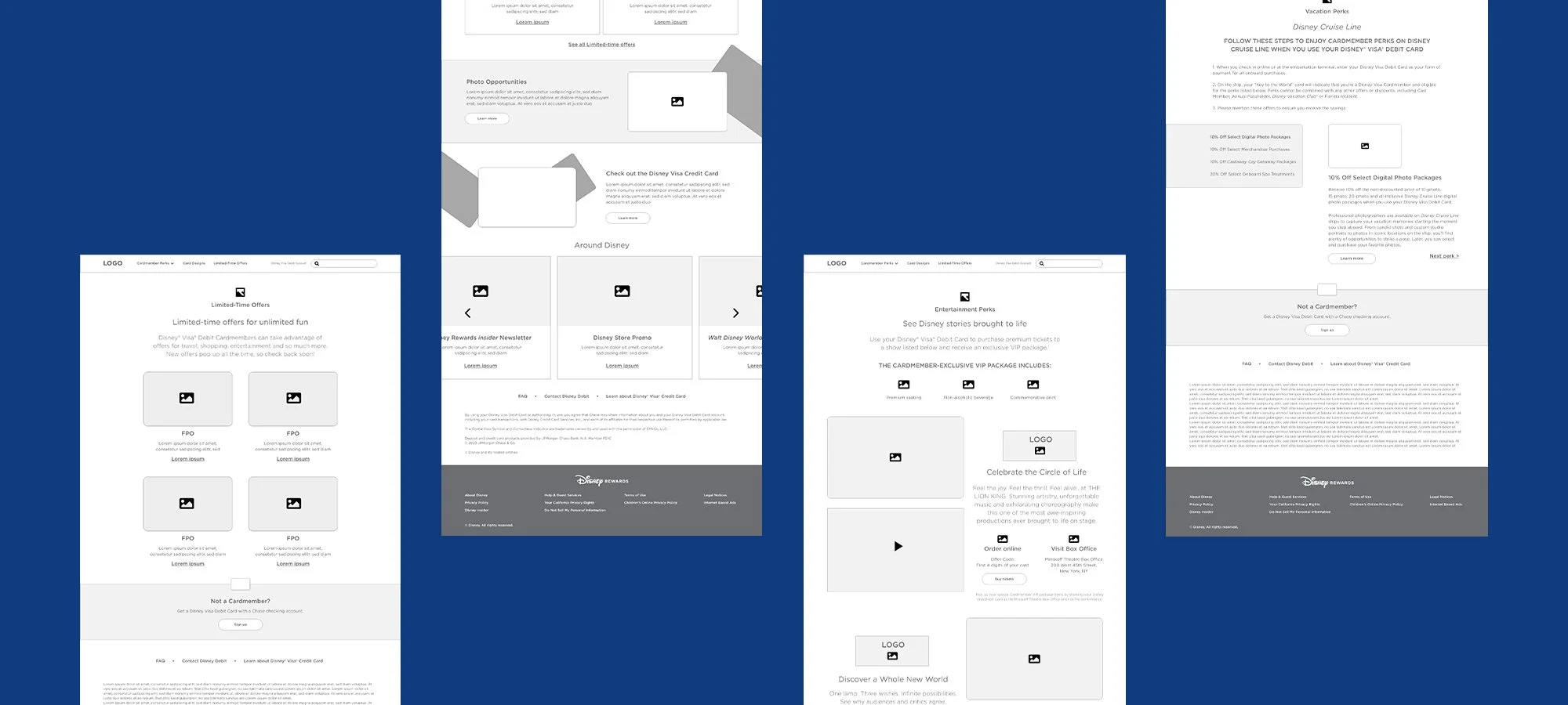
The homepage stood out as a key area to improve, so I sketched out ideas to bring in better navigation and clearer call-to-actions. I referenced other Disney sites for style consistency, then turned those wireframes into detailed mockups with notes for developers to ensure a smooth handoff.
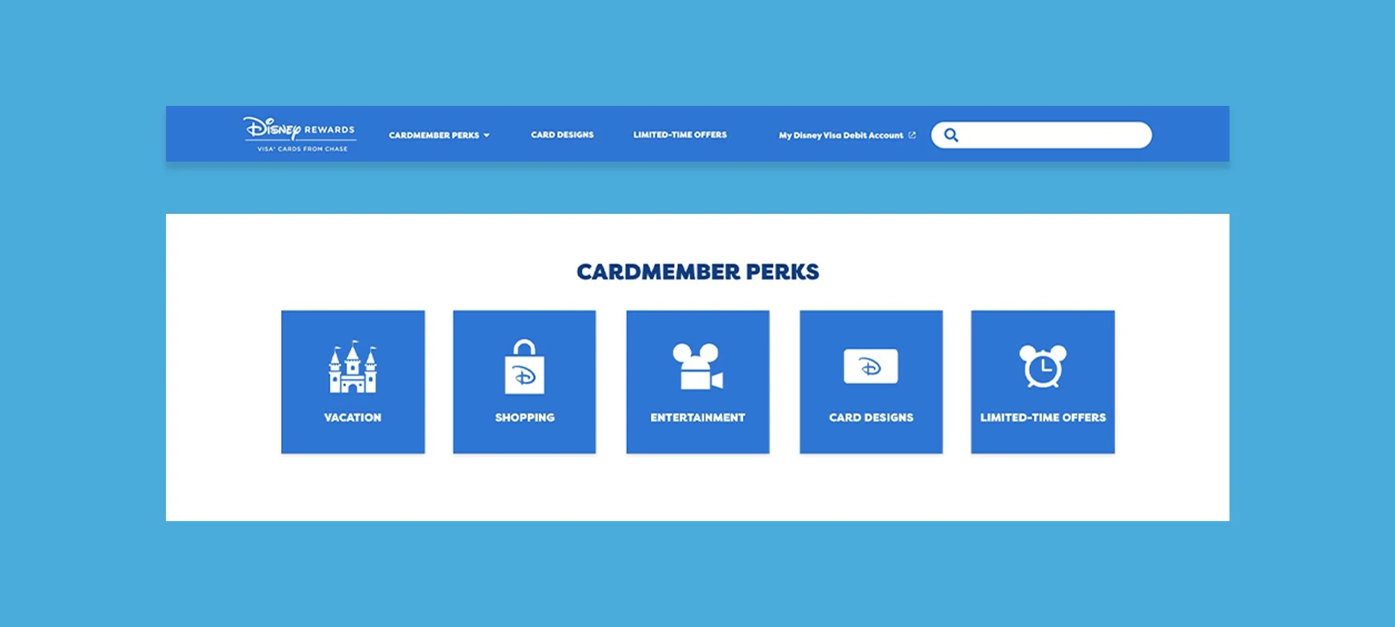
A big focus of the redesign was making Disney perks more visible—things like exclusive theme park promos, merch discounts, and special offers—so cardholders could immediately see the value of their Disney Visa Debit Card.
We also reworked the navigation to be more intuitive, with clear menus and icons that made it easy to find card designs, limited-time deals, and perks without any guesswork. On top of that, we cleaned up the site’s information architecture, grouping related content into digestible sections. This kept things organized, reduced clutter, and helped users quickly find what they needed without feeling overwhelmed.

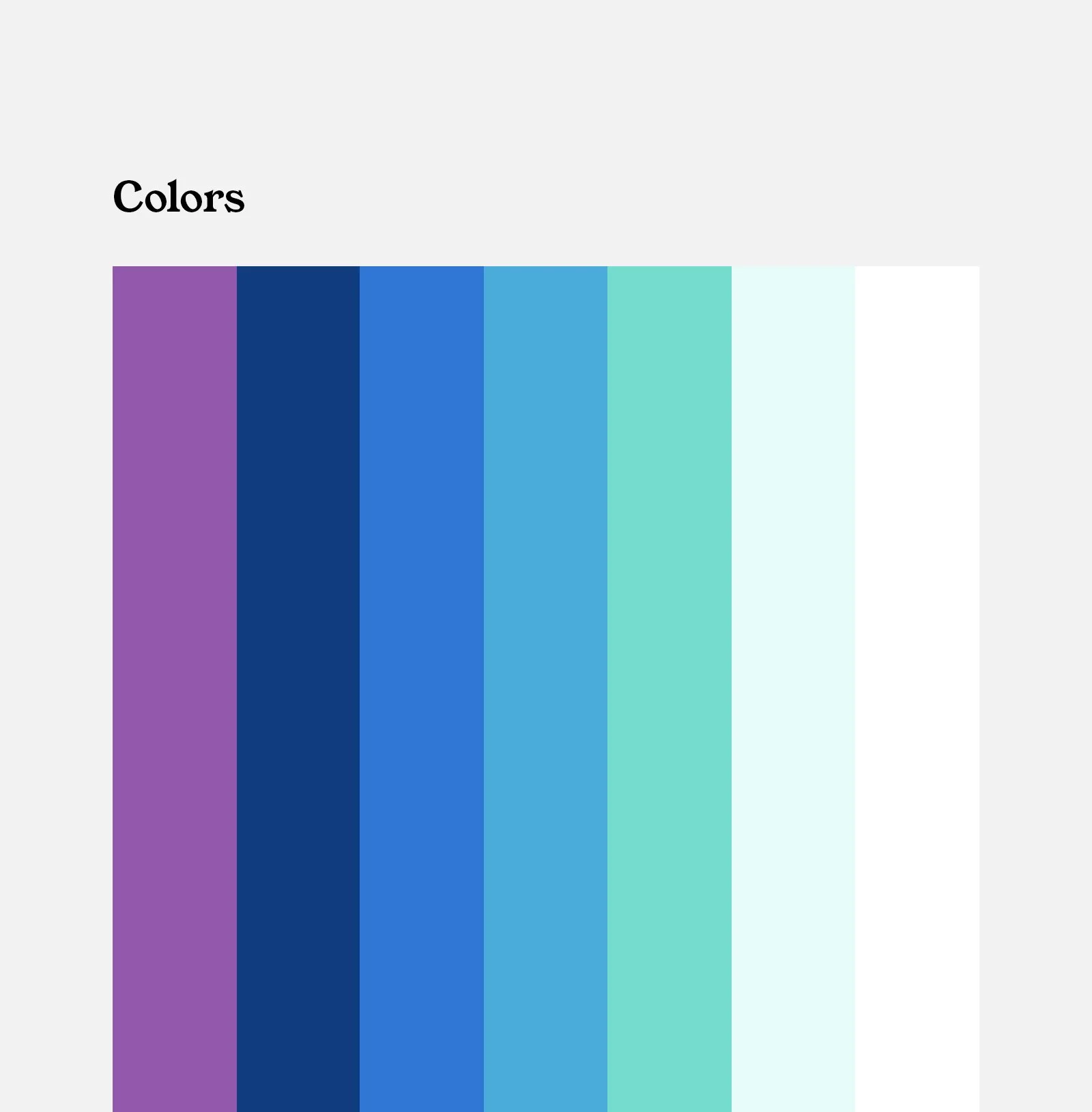

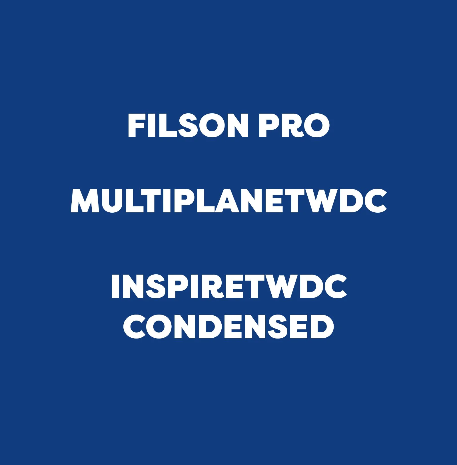
For the site redesign and rebrand, I closely followed the existing brand guidelines to maintain consistency with the refreshed identity.
At the same time, I developed digital-specific standards to make sure the brand translated seamlessly online. This included guidelines for interactive elements like buttons and hover states, a responsive grid system for layouts, and typography adjustments to boost readability and accessibility. I documented everything in a detailed style guide, giving developers and content creators a go-to resource to keep the site cohesive and on-brand across every screen.


The redesign led to a noticeable boost in user engagement—cardholders were visiting the site more often, exploring Disney perks, and interacting with content thanks to the intuitive layout and mobile-friendly design.
By making perks easier to find and redeem, we also saw higher conversion rates on special offers, which helped drive loyalty and card usage. Overall, the improved experience led to increased customer satisfaction, with users appreciating how simple it was to manage their accounts and access rewards across devices.
